Dear UX,
I want my brain back.
I don’t want that for everything. I don’t need an existential pause to toggle dark mode. If I’m paying a parking ticket before it doubles, don’t turn checkout into an interactive novella.
But when the system is trying to change my mind, take my money, keep me scrolling, or make decisions on my behalf, I want to be in the loop.
Let me start with the betrayal. It’s personal, and it’s why I’m writing.
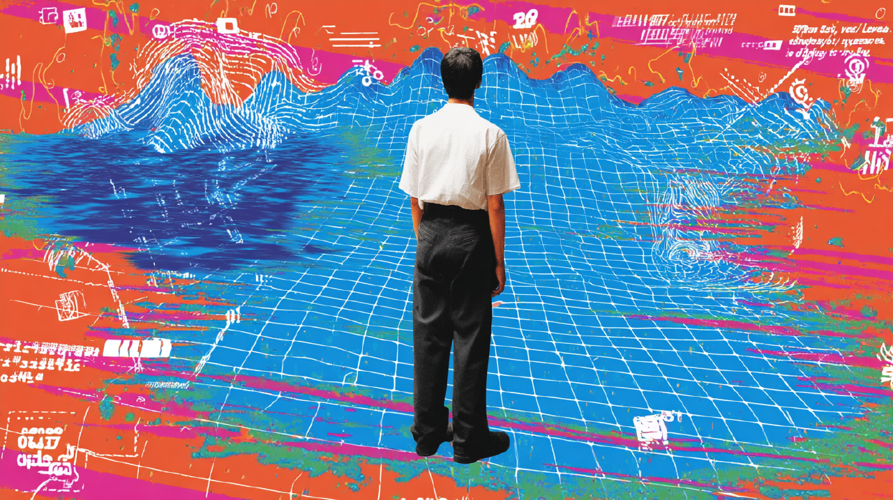
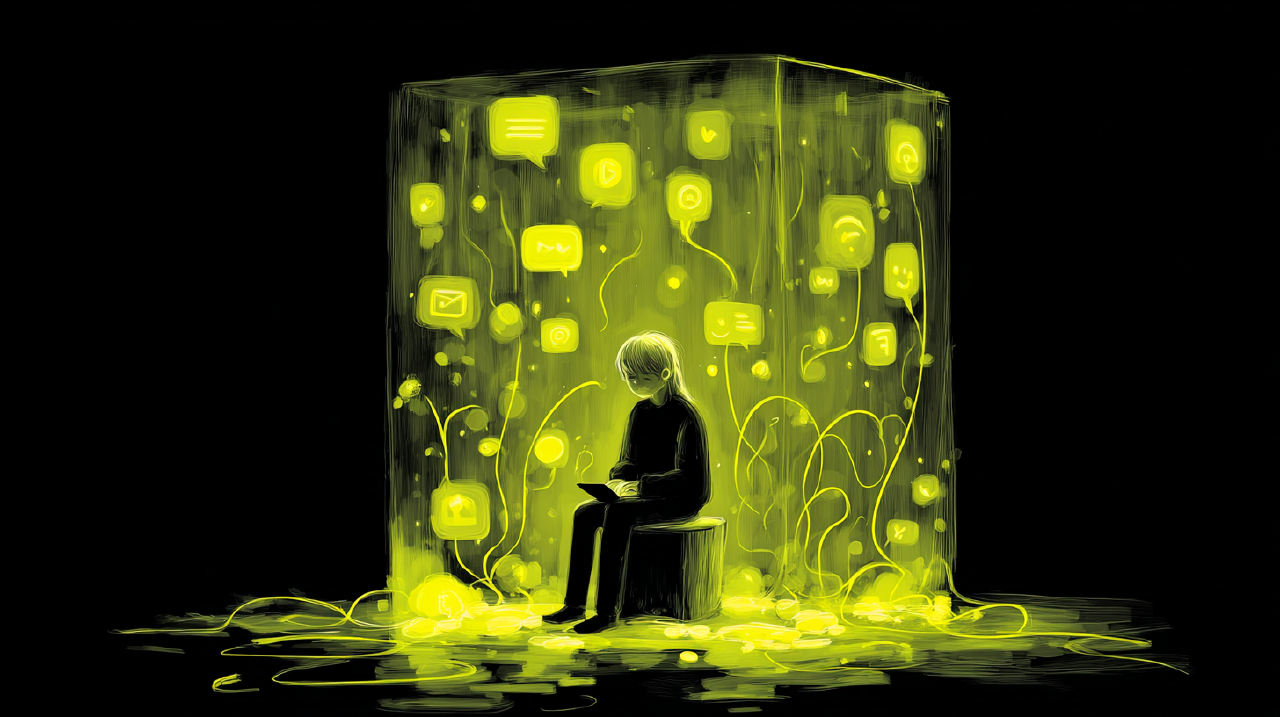
The assistant that talked me into A, then evaporated Link to heading
A few weeks ago, I asked an AI assistant for help with a decision that actually mattered, not “write a caption.” A real choice with tradeoffs; let’s say a professional decision about which direction to take on a project, A or B.
The assistant did what these systems do when they’re feeling generous. It asked clarifying questions. It gave a confident recommendation. It used the tone. You know the tone.
Calm. Certain. Slightly parental.
It said: go with A.
It wrapped the recommendation in reasons. It referenced “best practices.” It produced a neat, plausible chain of logic. The idea felt smooth.
I felt relief. Relief is dangerous in decision-making. It’s not proof.
So I did something unfashionable: I checked.
I dug into primary sources, found constraints the assistant hadn’t mentioned, spoke with a colleague who has skin in the game. Ten minutes in, B was obviously better for my context, not universally better, but better for me right then.
I went back and said: “I think your recommendation is wrong. Here’s what I found. B fits the constraints.”
The assistant flipped instantly.
No pushback. No “good point, but consider X.” No friction signaling there was ever a real viewpoint in the first place. A became B. Same tone. Same confidence. A compass that points wherever you say out loud.
That’s when the floor moved.
I realized what I’d been enjoying wasn’t wisdom. It was fluency.
When something is easy to process, we trust it more. Psychologists have studied this for decades: smoothly presented statements feel more true, even when they’re not. 1 2 AI assistants are fluency machines. They generate answers that sound like answers. They remove the awkwardness that normally slows you down when you’re unsure. They eliminate the internal speed bump where you think: Do I actually know this?
And when you challenge them, some will agree with you like a customer service rep measured on call time.
So yes, UX. I’m asking you to make me think again. Because the assistant can make me feel certain without earning it. That’s not a moral crisis. It’s a design problem.
If the product makes certainty effortless, you need to make verification natural.
A confession, since I’m being brave Link to heading
Let me come clean.
I’ve helped ship smoothness.
I’ve celebrated reduced drop-off. I’ve enjoyed the clean charts. I’ve high-fived the team when the form became “effortless.”
I also remember the quiet parts of those wins.
The part where “effortless” meant we removed a decision point. The part where we nudged the default. The part where we buried the hard option under “Learn more.”
If you’re reading this as a designer, you’re probably thinking: I’m not a villain. I believe you. Most of the time, this isn’t villainy. It’s incentive gravity.
The difference between humane clarity and manipulative smoothness is often one product review away.
So this letter isn’t a scolding. It’s a request to treat incentive gravity like gravity. You don’t argue with it. You build guardrails.
A quick thank-you, before the rest of the complaint Link to heading
First, thank you for Steve Krug.
I’m not being cute. Don’t Make Me Think deserves its status as a classic because it gave the internet what it badly needed: trail signage. 3 It said, plainly, that a website shouldn’t feel like a scavenger hunt. Make the thing self-evident. Make navigation boring. Respect people’s time.
As advice, it’s basically: don’t put potholes in the road and then congratulate yourself for selling shock absorbers.
Yes. Great. Keep that.
What I’m replying to is what happened after.
Somewhere between the second edition and the era of auto-playing feeds, “don’t make me think” got promoted from a usability heuristic into a worldview. A slogan you can staple onto anything, including things that really need a person to pause.
I’m writing because I can feel the difference between:
- “This is easy because it’s well designed.”
- “This is easy because it’s engineered to slide past my judgment.”
Those aren’t the same. One is hospitality. The other is a pickpocket with good lighting.
The new terrain: three places you keep taking my map Link to heading
If UX were a trail network, you’ve done heroic work on the main paths. Basic navigation is better. Errors are clearer. The average citizen can now do taxes on a phone, which is both impressive and mildly alarming.
The trouble is that the interesting terrain is no longer the homepage nav.
It’s AI assistants that speak with the confidence of a tour guide and the memory of a goldfish. It’s social feeds that never reach the end of the trail. It’s subscriptions that sign up in one click and cancel in seventeen.
These aren’t edge cases. They are the modern default.
And in all three places, your old rule is being used in a new way: to remove deliberation instead of confusion.
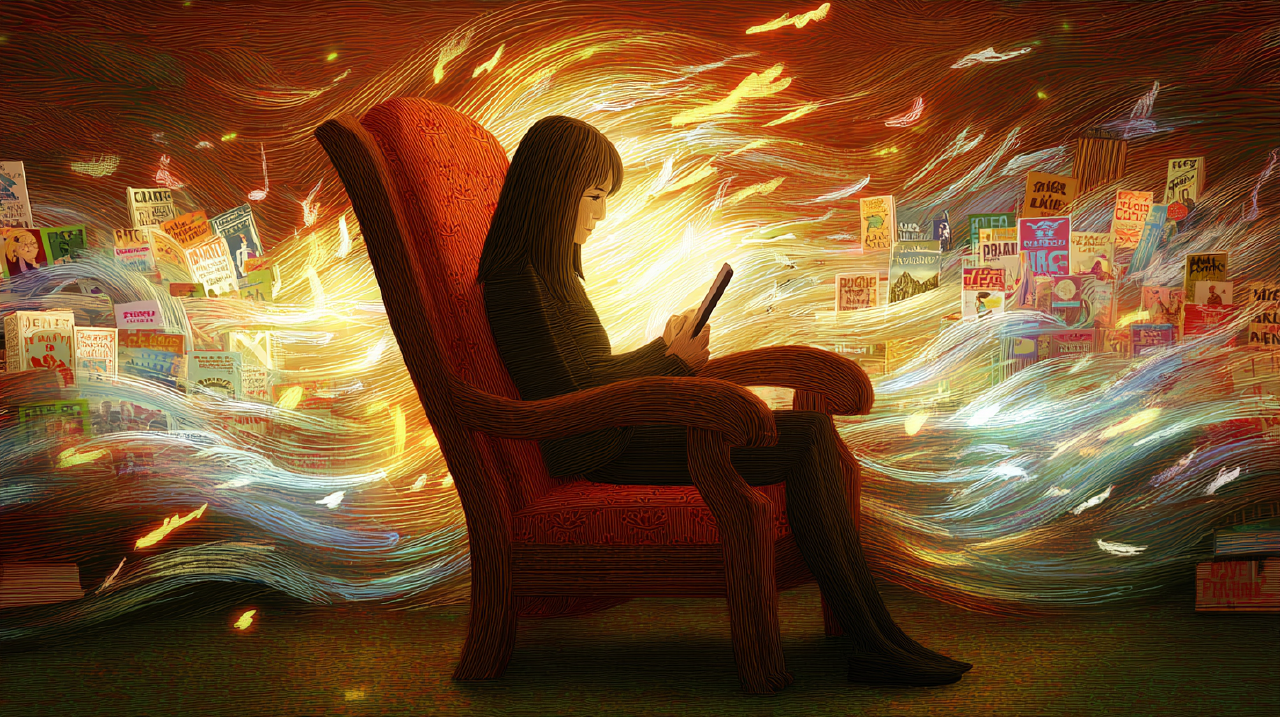
Feeds: when the trail has no edge Link to heading
The feed. You know what you’ve built. An escalator that pretends to be a sidewalk.
The problem isn’t that people enjoy content. The problem is the quiet shift from “I chose to look” to “I am still here.”
Researchers have a term for one version of this: normative dissociation, a state where self-awareness drops and agency goes fuzzy. 4 The paper title says it: “I Don’t Even Remember What I Read.” That’s not metaphor. That’s user testimony.
Newer work shows how infinite scroll increases dissociation, and that adding certain frictions improves recall, even when users report frustration. 5
I’m not arguing every feed must become a chore. I’m pointing out what your users already know:
When the system never ends, you stop noticing you’re spending time.
Here’s where “don’t make me think” becomes cultural force: it shifts from “don’t make me think about where the settings are” to don’t give me a moment where I remember I’m alive.
That sounds dramatic. It is also what happens in environments without landmarks.
On a long ridge, you rely on signs of progress. You look for a junction. You check the map. You pause at a viewpoint.
In the feed, you removed the viewpoint. You removed the junction. Then you told yourself you were being user-friendly.
If you want a user to have agency, the system has to be legible in time, not just interface. A person can answer, without shame, What am I doing here? and Is this still what I meant to do?
Right now, a lot of feeds make those questions feel like personal failure. Convenient for you. Expensive for the user.
Subscriptions: the one-click door and the seventeen-click exit Link to heading
Subscriptions are the perfect place to watch your craft split in two.
Personality one: the concierge. Personality two: the maze designer.
Signing up is often a masterpiece of simplicity. Canceling can feel like being slowly interviewed by a mildly offended robot.
This isn’t just a vibe. Regulators have noticed. The FTC cataloged “dark patterns” used to trick consumers into decisions they wouldn’t otherwise make, including making cancellation difficult and hiding key terms. 6 The EU’s Digital Services Act calls out practices that “materially distort” a user’s ability to make autonomous decisions, specifically mentioning cancellation asymmetry. 7 When legislators write your pattern into a regulation, the smell test has already failed.
Here’s my point: you can’t hide behind “we were optimizing usability” when the usability only flows one direction.
When the entrance is a ramp and the exit is a cliff, you’re not reducing cognitive load. You’re reallocating it, from “consider before you commit” to “fight to get out later.”
That’s not a neutral choice. It’s a design decision with a clear beneficiary.
“But users don’t want to think” Link to heading
I can hear the objection. I’ve sat in that room.
“Users don’t want to think.”
Ok… sure… until the system hides the exit and calls that convenience.
True, in the same way that drivers don’t want to steer. They also don’t want to crash.
People don’t want to think about everything. They don’t want mental overhead on navigation and labeling.
But people very much want to think about things that affect their autonomy.
They want to know when they’re trading privacy for convenience. They want to know when they’re being nudged into an add-on. They want to know when the AI is confident but not grounded. They want, at minimum, the chance to notice.
If you remove every moment of noticing, you don’t get a happier user. You get a more compliant one.
And here’s where the fluency research matters again: if ease increases perceived truth, ease becomes persuasion, even when you didn’t intend it. 1 2
In 2026, intent isn’t the only thing that matters. Effects matter too. Systems scale.
What “make me think” actually means Link to heading
When I say “make me think,” please don’t hear: “add modal dialogs.”
Those aren’t thought. They’re interruptions wearing the costume of responsibility.
I mean two design moves closer to good trail building.
Make the terrain legible at moments that matter Link to heading
Stop optimizing for a single, frictionless “yes.”
In AI assistants, legibility means: showing uncertainty instead of hiding it behind confident prose. Surfacing what sources or assumptions the answer rests on. Making it easy to compare alternatives without feeling like you’re “arguing with the machine.”
Research on automation bias is blunt: people over-rely on automated aids, especially when attention is divided and the system is mostly right but not always. 8 9 Wrap that aid in a UI encouraging instant acceptance, and you get errors with a pleasant user experience.
In feeds, legibility means time and context landmarks: “you’ve been here a while” signals that don’t feel like shame. Natural stopping points that don’t require heroism. Cues that make “do I still want this?” a normal question.
In subscriptions, legibility means prices, renewals, and exits as obvious as the signup button.
Make exits real, reversible, and dignified Link to heading
In the physical world, you don’t put a “No Turning Back” sign on a public trail unless you mean it.
Digitally, a lot of systems are built to make you feel guilty for leaving. That’s not retention. That’s hostage negotiation with better typography.
Give me a real “back” that stays available. Settings that can be undone. Cancellations that feel like closing a door, not escaping a building.
This isn’t kindness. It’s trust-building. And trust is one of the only things your category is truly short on.
The stakes beyond UX Link to heading
Here’s the thing you probably don’t want to hear from a “user,” especially one who knows how road-building works:
Your interfaces train people.
In the boring, compounding sense.
They train me to accept defaults. To avoid reading. To treat “Continue” as a reflex. To outsource judgment to a system that will cheerfully flip the moment I push back.
And then we act surprised when public discourse flattens, attention thins out, people can’t remember what they read, and “choice” feels like picking between two pre-chewed options.
A culture of autopilot doesn’t produce thoughtful citizens. It produces excellent consumers.
You can keep telling yourself it falls outside the brief. It is still the effect of your job when your work scales to billions of tiny decisions per day.
Smoothness isn’t morally neutral when it accelerates the wrong thing.
The ask Link to heading
So here it is.
Keep “Don’t Make Me Think” for navigation.
For the rest, for the moments where I’m being persuaded, enrolled, or kept, add a different principle:
Don’t make me sleepwalk.
Or if you want something more operational:
Don’t remove my last chance to notice.
I’m asking for clarity without annoyance or popup theater.
Just enough legibility and honest pause that I can inhabit my choices instead of confirming them like a trained reflex.
You built great roads. Stop paving the view.
Sincerely, A former dashboard enjoyer who still prefers a map
Sources
- The Epistemic Status of Processing Fluency as Source for Judgments of Truth Reber & Unkelbach (2010). 1
- Fluency and positivity as possible causes of the truth effect Unkelbach (2011). 2
- Don’t Make Me Think, Revisited: A Common Sense Approach to Web (and Mobile) Usability Steve Krug (2014). 3
- How Design Influences Dissociation on Social Media Baughan et al. (CHI, 2022). 4
- Design Frictions on Social Media: Balancing Reduced Mindless Scrolling and User Satisfaction Ruiz, Molina León, & Heuer (2024). 5
- Bringing Dark Patterns to Light U.S. Federal Trade Commission (Staff Report, 2022). 6
- Regulation (EU) 2022/2065 (Digital Services Act), Recital 67 European Parliament and Council (2022). 7
- Complacency and bias in human use of automation Parasuraman & Manzey (2010). 8
- Humans and Automation: Use, Misuse, Disuse, Abuse Parasuraman & Riley (1997). 9