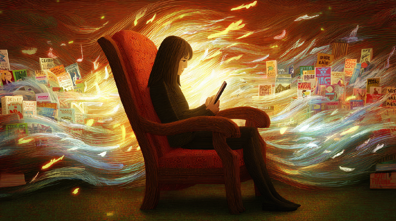
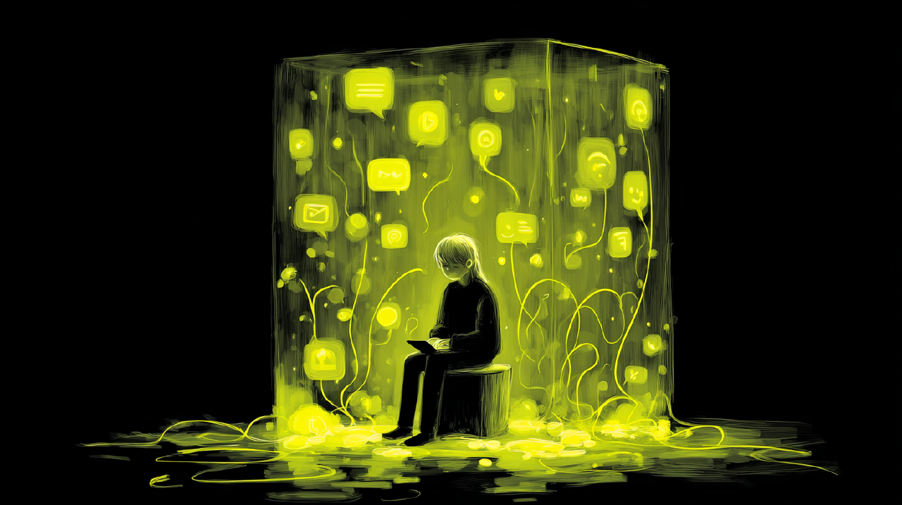
It was snowing. The wet kind that turns the road into a reflective problem.
I reached for the defroster. The car had replaced a real knob with a glass panel and a small icon clearly designed by someone who never wears gloves. My finger hit the wrong thing. The screen politely did something else. I glanced down to fix it.
That glance was short. It was also a mistake.
This was sold to us as modern. It wasn’t modern. It was a design failure.
Car manufacturers are now reversing course, and the language sounds less like marketing than contrition. Volkswagen’s promise: “We will never, ever make this mistake again.” Euro NCAP is writing physical controls into safety protocols. Starting in 2026, five-star ratings will require buttons for indicators, hazard lights, wipers, horn, and SOS.
This isn’t an aesthetic debate. It is being codified into law.
If you design software, pay attention because we keep shipping the same mistake.
Glass buttons.
The seduction Link to heading
We need to understand why glass won before we can see what it cost.
Glass promised purity. A slab of nothing. No bezels, no mechanical clutter, no fingerprints of the past. The screen became a window onto pure information, limited only by imagination and firmware updates. Physical buttons were skeuomorphs, embarrassing remnants of an analog era. The future was surface.
And glass delivered. It enabled interfaces that can reconfigure themselves endlessly. It let designers iterate without retooling factories. It slashed cost and expanded possibility. Every phone became a camera, a compass, a piano, a passport. This wasn’t nothing.
But purity has a price. A surface that can be anything has no inherent resistance. And resistance, it turns out, is how we know things.
The cost Link to heading
A physical button gives you three things for free. You can find it without looking. You can feel state: half-press, click, detent, end-stop. You can feel consequence.
A glass button gives you none of that. It forces vision to supervise everything.
The auto industry made this trade in the worst possible environment. Driving is a full-body task. Research on infotainment systems has found reaction-time impacts rivaling impairment thresholds; touchscreen interactions degrading attention and lane control in ways we’d never accept from a drink or a drug.
Software repeated the error at scale. We turned publish, delete, approve, share, pay, confirm dose, send to clinician, and erase into the same smooth rectangle. Same feel. Same silence.
It looks clean. It feels empty.
This isn’t just a UX problem. It is an epistemological one.
Donald Schön described professional practice as a conversation with the situation: you act, the situation responds, you adjust. John Dewey framed experience as doing and undergoing, action followed by felt consequence. This loop is how we learn. How we calibrate. How we stay in the world rather than floating above it.
Glass buttons break that loop. They let you act, but they don’t help you undergo.
The turn Link to heading
There is a temptation here to romanticize the mechanical past. Resist it.
We aren’t going back to rotary dials and rocker switches. No need to. The question isn’t glass versus plastic. The question is whether an interface can speak back to the hand.
Increasingly, it can. Surface haptics (electrovibration, friction modulation, ultrasonic actuation) are turning glass into something closer to a material. Apple’s Taptic Engine has been teaching the industry for a decade that screens can punch above their weight. The constraints are dissolving.
What remains is a design vocabulary we forgot how to speak.
Frictology isn’t nostalgic. We’re not mourning the analog past. We’re trying to recover a grammar, one that lets commitment feel different from exploration, completion different from cancellation, consequence different from acknowledgment.
The tools exist. The discipline is what’s missing.
A grammar of tactility Link to heading
Take a familiar moment: you’re in a note-taking or collaboration tool. You draft something rough but useful. Then you hit Publish to push it into a shared space.
This isn’t “Next.” It is a threshold.
In most products, Publish is a pill-shaped button in the corner. You tap it. The UI flips state or shows a spinner. Maybe there’s a toast. Maybe not. Sometimes you realize later you published the wrong draft to the wrong audience.
That isn’t user error. That’s a design failure.
Let’s rebuild the loop.
Timing is material Link to heading
Jakob Nielsen’s response-time thresholds still hold: 100 milliseconds feels instantaneous, 1 second preserves flow, beyond that attention wanders. The mistake is aiming for “instant” everywhere.
Exploration stays fast. Commitment carries weight.
A Publish action has two jobs: ensure the user intends it, and ensure the user knows it happened. Teams solve this with confirmation modals and disappearing toasts. Both are admissions of failure.
A better pattern uses micro-weight. Publish becomes a short press-and-hold for 400 to 800 milliseconds. Releasing early cancels quietly. Completion produces a crisp state change and a single haptic punctuation.
This doesn’t slow people down. It gives the action a landing. It feels less like paperwork and more like closing a latch.
Haptics are punctuation Link to heading
Most interfaces either overuse haptics or avoid them entirely. Apple’s guidance is blunt: haptics must stay sparse and purposeful, or they become noise.
Treat them like punctuation marks. Selection: light tick. Boundary: firm stop. Commit: short, confident tap. Error: distinct, not dramatic.
Publish must never feel the same as Like.
Consistency matters. When the same haptic always means “commit,” the body learns. The eyes relax. Trust increases.
This also matters for accessibility. Haptics can support users with low vision, attention variability, or motor challenges, but only if they respect system settings and are never the sole carrier of meaning.
Grain is information Link to heading
Crafted objects have grain. Your fingers learn it.
Interfaces can have grain too. Temporal grain: easing, settle, resistance. Tactile grain: detents, ticks, stops. Visual grain: microinteractions that reveal state.
Consider audience selection. Publishing usually includes a choice: team, public, private. These options are often presented as interchangeable pills.
They aren’t interchangeable.
Adding detents, tactile and visual snapping between discrete states, turns the control into a dial. The body feels the difference. This is exactly why physical controls work in cars. They teach state through resistance.
After Publish, most systems just change the label. A crafted system shows consequence. Where it was published. The first visible footprint. An undo window that feels like an emergency brake, not a loophole. These are receipts. They keep the loop intact.
Honest imperfection Link to heading
Wabi-sabi is often misunderstood as “make it look handmade.” It is not. Leonard Koren describes it as an ethic that accepts imperfection, impermanence, and incompleteness.
Software is never finished. Pretending otherwise erodes trust.
Drafts need to be first-class citizens. History needs to be legible. The system needs to distinguish user intent from system inference. Commitments need to be revisitable and understandable later.
Here’s where AI-assisted tools are currently failing. They generate output without provenance, then wonder why users hesitate to publish it. If you want trust, show the seams.
Where glass works Link to heading
Touchscreens are excellent for dense information, dynamic layouts, exploration, and creative play.
They are poor at eyes-busy contexts, high-consequence actions, and accessibility scenarios that rely on non-visual cues.
Cars learned this the expensive way. Software still treats it as a style preference.
The test Link to heading
Audit your product for actions that are irreversible or socially expensive. Actions performed under distraction. Actions frequent enough to become muscle memory. Actions composed of discrete states. Actions better felt than re-read.
When you find one, don’t add a modal.
Give it a body.
There is a line from Merleau-Ponty that keeps surfacing in this work: we don’t observe the world; we inhabit it. Tools shape how we perceive and act. Don Ihde called this the technological lifeworld, the way devices become extensions of our sensing, our reaching, our knowing.
For a decade, we designed interfaces that asked the eyes to do everything. The hand became a pointer. The body was exiled from the loop.
We can bring it back. The haptic engines are ready. The research is there. What’s missing is the conviction that this matters, that the feel of an action isn’t decoration but meaning.
If an action can’t be felt, it can’t be fully owned.
We optimized for frictionlessness. We got weightlessness. They aren’t the same.
Sources
- Euro NCAP announces 2026 protocol changes to tackle modern driving risks Euro NCAP (2025). 1
- Euro NCAP Protocol: Safe Driving – Driver Engagement (v11.0) Euro NCAP (2025). 2
- Cars will need buttons, not just touchscreens, to get a 5-star rating ETSC (2024). 3
- Volkswagen is bringing back physical buttons The Verge (2025). 4
- “It’s not a phone, it’s a car” – VW commits to buttons The Drive (2025). 5
- Drivers struggle to multitask using dashboard touchscreens University of Washington (2025). 6
- Infotainment systems more dangerous than alcohol Autovista Group (2020). 7
- Response Time Limits: 3 Important Limits Nielsen Norman Group. 8
- Playing haptics Apple Human Interface Guidelines. 9
- Microinteractions in user experience Nielsen Norman Group. 10
- Dewey’s aesthetics Stanford Encyclopedia of Philosophy. 11
- Maurice Merleau-Ponty Stanford Encyclopedia of Philosophy. 12
- The Reflective Practitioner Donald A. Schön. 13
- Wabi-Sabi for Artists, Designers, Poets & Philosophers Leonard Koren. 14
- A review of surface haptics Basdogan et al. (2020). 15
- Technology and the Lifeworld Don Ihde. 16


