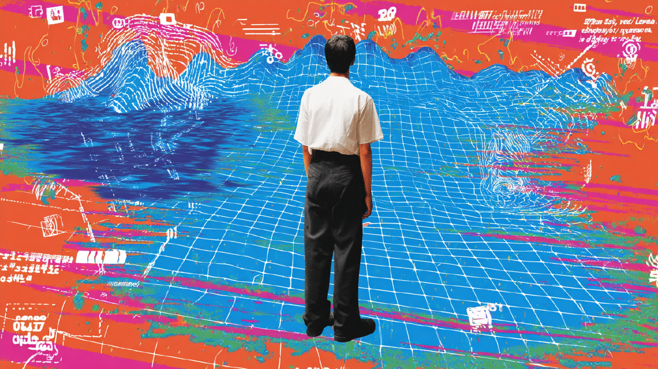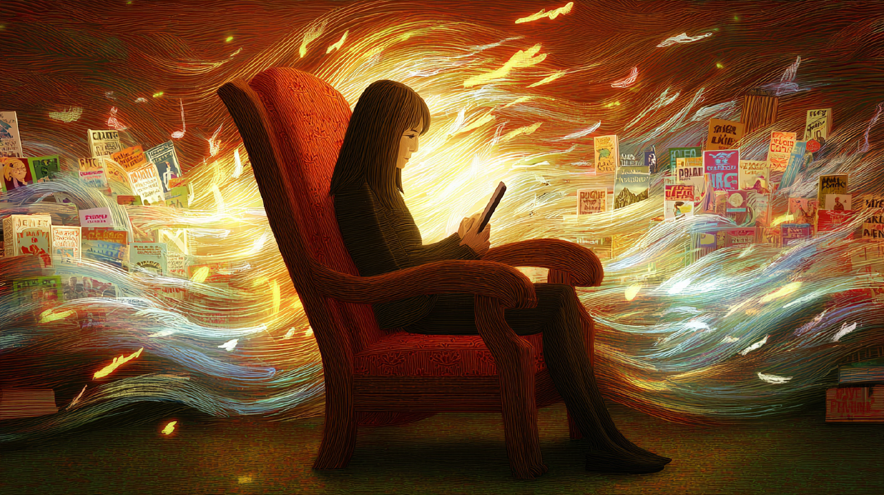

You know the moment.
You open TikTok for “a second.” You aren’t sad. You aren’t bored in the usual way. You are just checking. A scan for novelty, for signal, for something that clicks.
Twenty minutes later, you blink like you walked out of a tunnel.
And the only coherent thought you have is: one more swipe.
That phrase is the whole problem. It is also the map out. We just have to read it at five zoom levels.
One more swipe: as physics Link to heading
At the first zoom, “one more swipe” isn’t a craving. It is a default.
Infinite scroll loads content continuously, eliminating pagination 1 . That sounds neutral: stairs replaced with a ramp. But pagination was doing something. It placed trail markers. It gave your brain a natural spot to ask: continue or stop?
Remove the marker. You get uninterrupted movement. You also get fewer decision points.
NN/g frames this politely: infinite scrolling lowers interaction cost; a “Load more” button raises it, even slightly 2 . They note the consequence: that small interruption means users consume less and switch tasks more often 2 .
A boundary doesn’t have to shout. It just has to exist.
That’s why infinite feeds feel effortless. They aren’t more content. They are fewer exits.
One more swipe: as bet Link to heading
Zoom out. “One more swipe” starts to look rational.
A feed isn’t a steady stream of value. It is a patchy landscape. Five forgettable posts, then one perfect one, a video tuned to the exact frequency your nervous system prefers today. A comment that tells you, briefly, you aren’t alone.
That patchiness matters. Brains learn from reward schedules.
Variable ratio reinforcement is payoff after an unpredictable number of responses; it produces high, steady response rates resistant to extinction 5 . The organism keeps going because the next response can be the one that pays.
Scrolling is the response. The occasional hit is the reward.
Notice the inner logic:
- Last few swipes boring? The good one is probably coming.
- Last swipe good? There might be another.
Either way, “one more swipe” makes sense inside the system. You aren’t irrational. You are responding appropriately to uncertainty.
This is also why blunt interruptions fail. If the system trained “keep going” under uncertainty, a pop-up saying “take a break” has to compete with a learned strategy. Not a fair fight.
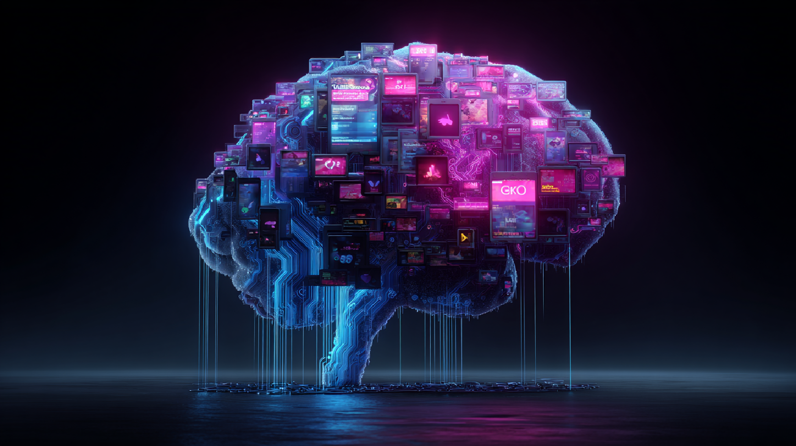
One more swipe: as machinery Link to heading
Now we hit the part everyone talks about, usually slightly wrong.
People say “dopamine loop” as if dopamine equals pleasure. It is closer to a teaching signal than a happiness potion.
Schultz, Dayan, and Montague showed that dopamine neurons report a reward prediction error: the difference between what you expected and what you got 3 . Unexpected reward? Spike. Reward becomes predictable? The spike moves to the cue. Expected reward fails to arrive? Dip.
In feed terms: the cue is the open app, the scroll gesture, the loading shimmer. The reward is the occasional high-salience post. The brain updates: this action, in this context, sometimes pays.
But there is another distinction: wanting isn’t liking.
Berridge and Robinson argue dopamine isn’t required for the pleasurable “liking” of a reward. It is tied to incentive salience, the cue-triggered “wanting” that pulls you toward the thing 4 .
This matches the lived paradox of modern feeds. You aren’t enjoying it, consistently. You still want to keep going.
So “one more swipe” can be a motivational pulse without being a pleasure peak. A movement signal. A vector, not proof that you are having a great time.
If you build products, this distinction matters. Wanting is measurable: watch time, return visits. Liking is quieter: I feel good about how I spent that hour. Those two outcomes don’t always correlate.
We optimized for the wrong one.
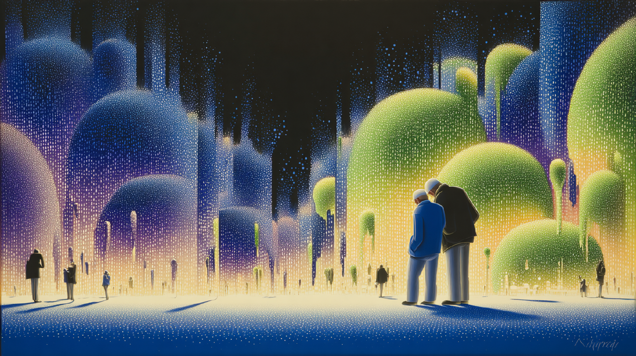
One more swipe: as time that dissolves Link to heading
There is a specific quality to time loss in endless feeds. It’s not the same as getting absorbed in craft, conversation, or film.
It feels more like time dissolving than time flying.
Event Segmentation Theory suggests we maintain an internal “event model” of what is happening now. When prediction fails or context shifts, we update the model and perceive an event boundary 8 . Those boundaries help memory: objects at event boundaries are better recognized than those mid-stream 9 .
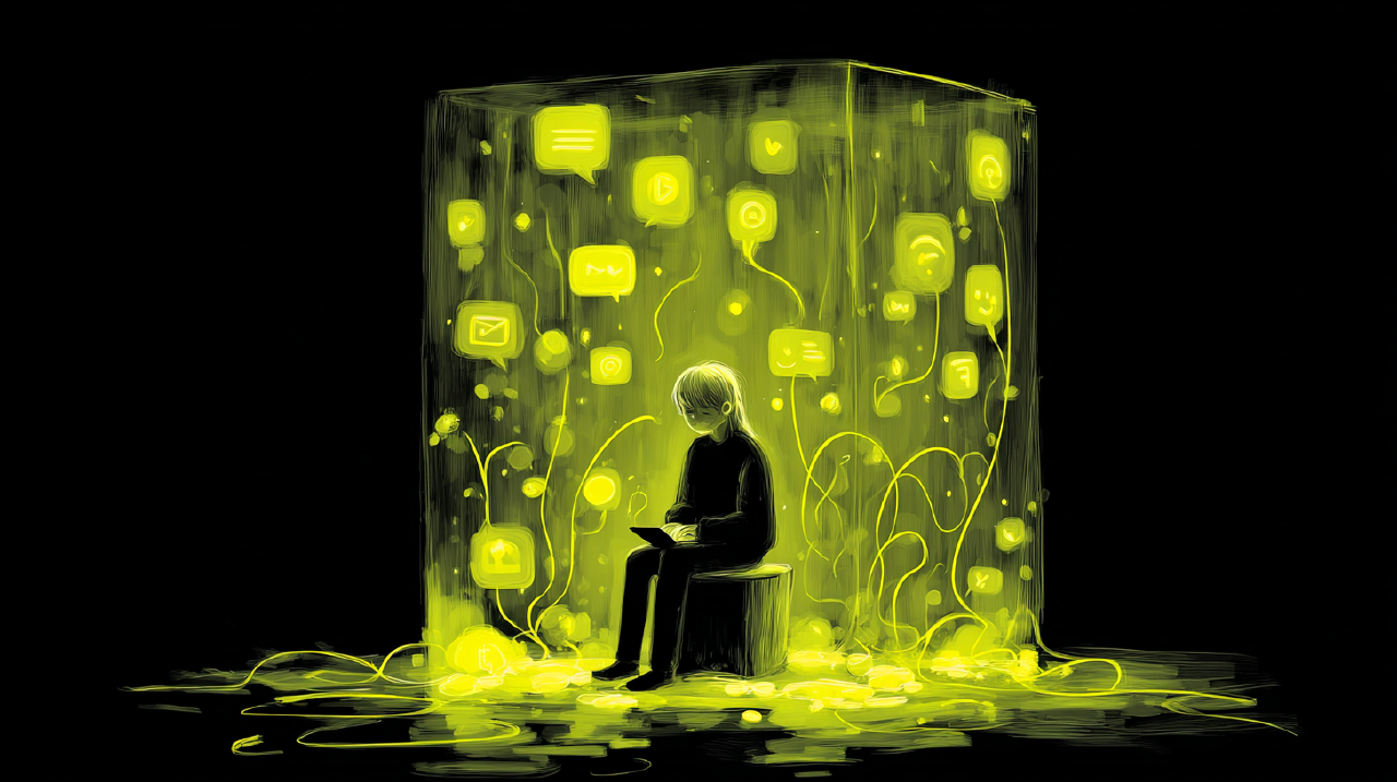
Now look at a feed session. Novelty, yes. But thin on meaningful boundaries. The “event” is the same action repeated: swipe, watch, swipe, watch. Content changes; posture does not. You rarely get closure, completion, or a natural “done.”
Lots of stimuli. Few anchors.
When anchors are scarce, memory gets foggy. When memory gets foggy, time becomes hard to estimate. The brain can’t construct a narrative: first I did X, then Y, then Z. It is more like: I was… in it.
That’s why “what did I even watch?” isn’t a joke. It is a diagnostic.
William James wrote that attention “implies withdrawal from some things in order to deal effectively with others.” The modern feed is built to reduce withdrawal. It keeps replacing “others” before you can name what you are leaving behind.
If you build tools for people, ask yourself: Does my product create experiences people can remember as episodes, or does it create time they can only account for by checking their battery percentage?
One more swipe: as default engineering Link to heading
You can test all of this with one small toggle: autoplay.
A 2025 experimental study on Netflix autoplay found that disabling it reduced consumption: less time watched, shorter sessions, and about 24 seconds more between episodes 10 .
Twenty-four seconds is nothing. It is also everything.
That pause is a space where a person can ask: Do I want another episode? Without it, the system asks on their behalf.
This is a mechanics argument, not a moral one.
If your design eliminates decision points, don’t be surprised when users stop deciding.
One more swipe: as you Link to heading
Here’s the uncomfortable turn.
You already knew most of this. You aren’t unaware. You are complicit. So am I.
We reach for the scroll because it works. It soothes the itch of boredom. It fills the void between tasks. It asks nothing of us. And that last part is the trap: a system that asks nothing eventually trains you to offer nothing.
Lukoff and colleagues studied YouTube use and found that autoplay and recommendations primarily undermined users’ sense of agency, while search and playlists supported it 7 . When users had a specific intention, they preferred interfaces that gave them greater control 7 .
The finding is not surprising. What is surprising is how rarely we design for it.
Agency isn’t “never get absorbed.” Agency is being able to choose the mode you are in, and to shift modes without needing a minor miracle.
The problem isn’t motion. The problem is unchosen motion.
Designing for one more swipe Link to heading
Vibes don’t ship. Let’s get practical.
Most “digital wellbeing” features are hall monitors: timers, nags, stern dashboards. Users ignore them. I don’t blame them. Timers and nags? Meh. A good product does not require a scolding layer to be safe.
If you want to preserve exploration and support autonomy, think waypoints, not roadblocks.
1. Partitions that feel like chapters Link to heading
Partitioning reduces consumption by introducing decision points, a small transaction cost that draws attention back to choice 11 . You don’t have to make it annoying. You just have to make it real.
In feeds, this might look like:
- A chapter break after N items, with a subtle summary of what you consumed.
- A soft “continue” affordance at the boundary, not mid-content.
- A reorientation screen offering modes: keep browsing, switch, or stop.
The boundary needs to feel like a trail marker, not a car alarm.
2. Let users set the recipe Link to heading
Most feeds behave like a blender. Comedy, crisis, beauty tips, war footage, productivity hacks, all chopped to the same bite size, served at the same cadence.
People don’t want that. Their nervous systems don’t want that.
Imagine a simple session recipe the user can set:
- 8 minutes lean-back (low load, entertainment)
- 6 minutes lean-in (social, relational)
- 6 minutes learn (tutorials, long-form)
Or whatever distribution fits. This isn’t paternalism. It is a playlist, expanded. A way of saying: I am here for this terrain right now.
And it creates boundaries that map to human meaning, not just time. You aren’t interrupting the experience. You are shaping it into something people can inhabit.
3. Make intention explicit, then protect it Link to heading
Lukoff et al. found search and playlists support agency, especially when users have a specific intention 7 . That suggests a simple move: let users declare intent at the trailhead.
Skip the big modal. Use a lightweight entry choice:
- Browse
- Catch up
- Learn
- Find something specific
Then let the interface honor that choice. Different defaults. Different pacing. Different stopping cues. Different recommendation aggressiveness.
Some things are up to us and some are not. You can’t control every user impulse. You can control whether the system respects a user’s stated intention, or quietly routes around it.
4. Optimize for remembered time Link to heading
Event boundaries anchor memory 8 . If you want users to feel good about engagement, you need experiences that can be recalled as episodes.
Design that creates narrative structure:
- “You finished a set.”
- “You completed a topic arc.”
- “You watched a lesson sequence.”
Flow, at its best, isn’t just absorption. It is absorption with structure: clear goals, feedback, a sense of control, a feeling that the time had a shape 13 .
Endless feeds can produce absorption. They often fail at the shape.
5. Build the pause into the system Link to heading
The Netflix study is a reminder: even a tiny pause changes behavior 10 . If you want to support agency, don’t outsource the pause to willpower.
Make it part of the default path to give the human a turn at the wheel.
The question that remains Link to heading
Return to the sentence.
“One more swipe” can mean:
- I chose to stay a little longer.
- I never got a clean moment to choose.
Those are different products. They create different people, over time.
If you build infinite feeds, you are building a landscape. Landscapes teach habits. Habits become character, slowly and without ceremony.
The provocation isn’t “infinite scroll is bad.” The provocation is sharper:
Products that don’t end build users who don’t stop.
If you can answer where agency enters, you are on the right trail.
Sources
- Infinite Scrolling is Not for Every Website Nielsen Norman Group (2014). Definition of infinite scroll and core tradeoffs. 1
- Infinite Scrolling: When to Use It, When to Avoid It Nielsen Norman Group (2022). Interaction cost, “Load more,” and behavioral effects. 2
- A Neural Substrate of Prediction and Reward Schultz, Dayan, Montague (1997). Reward prediction error framing for dopamine. 3
- Liking, Wanting, and the Incentive-Sensitization Theory of Addiction Berridge (2016). Dopamine more tied to “wanting” than “liking.” 4
- Reinforcement schedules (variable ratio) Lumen Learning, Introduction to Psychology (n.d.). Variable ratio schedules and resistance to extinction. 5
- How the Design of YouTube Influences User Sense of Agency Lukoff et al. (2021). Autoplay/recs undermine agency; search/playlists support it. 7
- Segmentation in the perception and memory of events Kurby & Zacks (2008). Event models, boundaries, and memory. 8
- Event boundaries in perception affect memory encoding and updating Swallow et al. (2009). Boundary moments structure memory. 9
- An Experimental Study Of Netflix Use and the Effects of Autoplay Schaffner et al. (2025). Disabling autoplay reduces consumption and lengthens pauses. 10
- The Effect of Partitions on Controlling Consumption Cheema & Soman (2008). Decision points and reduced consumption via partitions. 11
- Flow Nakamura & Csikszentmihalyi (2002). Conditions like clear goals and feedback that shape absorption into something meaningful. 13