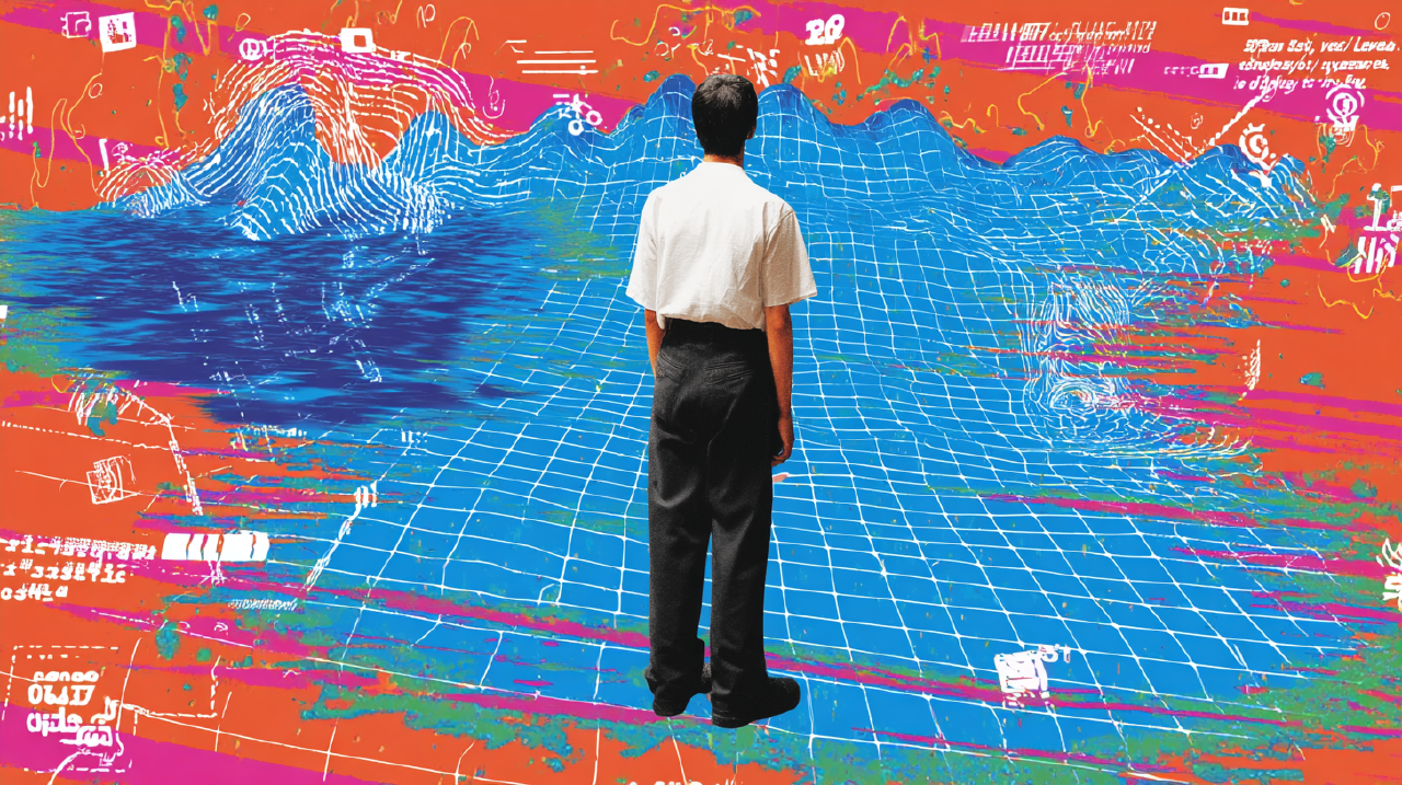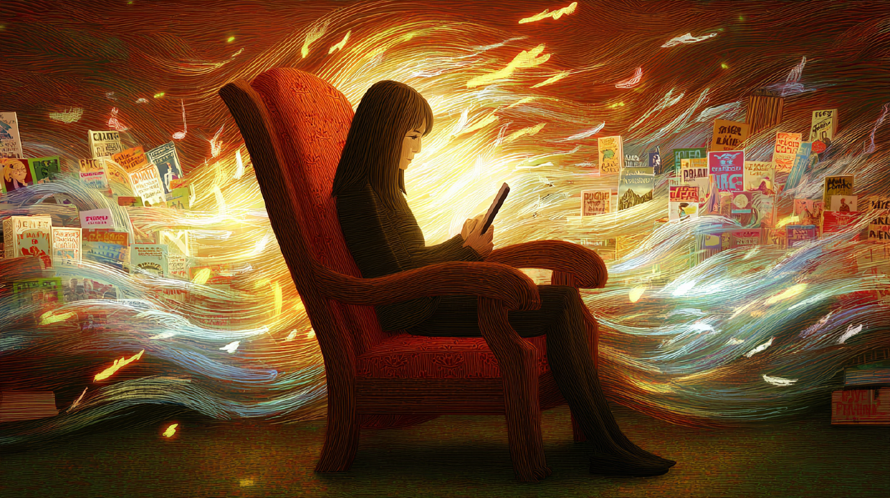

Your thumb opens the feed before your brain arrives.
You are waiting for coffee, or the train, or a meeting that started two minutes ago. The phone is already in your hand. The app is already open. The scroll has started. You did not sit down and decide, “Now I will consume an infinite list of other people’s lives, optimized for my nervous system.”
It just happened.
This is the part designers tend to treat as a user preference: “People like quick access.” But the more honest description is mechanical. It is a reflex loop. A tiny action, repeated often enough, becomes a default route.
And once a route becomes default, it stops feeling like a choice.
That’s the problem this essay is trying to address: giving users back a moment where they can steer. No scolding. No interruption theater. Small, well-placed design frictions that feel like footholds.
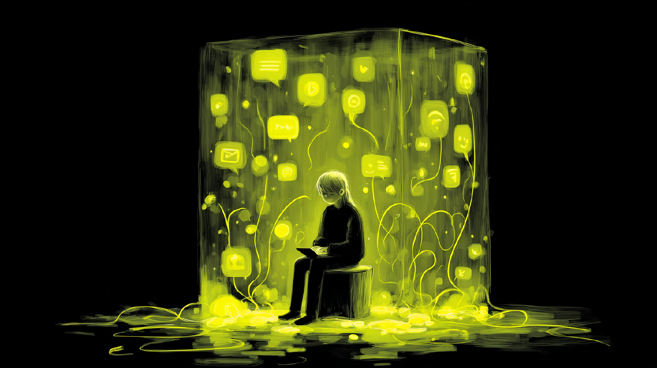
Your thumb isn’t your mind.
Why frictionless design creates fast engagement and thin memory Link to heading
Design culture has a habit of treating friction like rust in an engine. Remove it and the machine runs smoother. Then we measure “smooth” with the instruments we have: shorter flows, higher conversion, fewer drop-offs.
Those instruments aren’t lying. They are just incomplete.
In the physical world, a perfectly frictionless surface isn’t “better.” It is ice. It is slipping. It is the moment you realize you have momentum, but not control.
Digital experiences have been steadily polished toward ice.
When everything is optimized for speed, the user spends less time choosing and more time continuing. The interface stops being a place where you act, and becomes a place where you are carried.
Here’s where the thumb returns.
The scroll is frictionless by design, so the user doesn’t need to decide again. They only need to continue. The system rewards continuation with fresh novelty. The human system rewards continuation with relief from boredom, anxiety, uncertainty, awkward silence. Fast engagement, thin memory.
If you want a name for the cognitive mechanics, Daniel Kahneman’s popular framing still holds up: much of everyday behavior runs on fast, automatic thinking, and only occasionally hands off to slower, deliberate thinking 1 . The feed doesn’t ask for the slow system. It recruits the fast one and keeps it busy.
Your product can’t rely on “people being mindful” as a feature. That’s like relying on hikers to “be careful” on a trail you knowingly designed with loose scree and no handholds.
A pause isn’t a pop-up. A pause is terrain.
The useful kind of friction feels like terrain, not punishment Link to heading
Most “add friction” proposals fail because they confuse two different things:
- Friction that blocks.
- Friction that informs.
Blocking friction is the modal that stops the world and demands compliance. It can be necessary at times, but it often becomes a click-through ritual that teaches users one thing: ignore this.
Informing friction is different. It changes the shape of the moment without hijacking it. It helps the user notice what they are doing, and decide whether to proceed.
That distinction matters because reflection isn’t an outcome you can force. Reflection is something people do when the environment makes it possible.
This idea shows up explicitly in HCI. “Slow Technology” argued for designing systems that invite reflection and mental rest instead of optimizing only for efficiency 2 . “Reflective Design” made a similar move, pointing out that technologies often carry hidden assumptions, and that design can surface those assumptions rather than bury them under convenience 3 .
Neither of these papers says “make things annoying.” They are pointing at a different design goal: technology that creates space for thought.
Which returns us, again, to the thumb.
If the thumb can open the feed without the mind’s participation, the design is doing something. It is routing around the user’s agency.
So how do you add a foothold without turning the app into a nag?
One answer is a small amount of effort, the kind that signals meaning.
Effort changes value, but only when it lands somewhere real Link to heading
Here’s a counterintuitive fact that keeps reappearing in research: a moderate amount of effort can increase perceived value.
The IKEA effect is the best-known example. People value things more when they have participated in making them, even when the end product is objectively similar 4 . The mechanism isn’t mystical. Effort can create a sense of competence and ownership.
But the boundary condition matters. In the IKEA effect research, completion is important. Work that goes nowhere doesn’t produce love, it produces irritation 4 . You already knew that from your own life. Nobody cherishes the form they had to fill out twice.
Another related idea is the effort heuristic: people sometimes use perceived effort as a cue for quality or value, especially when quality is ambiguous 5 . When you can’t easily judge the object, you judge the process.
There is also nuance here worth respecting. More recent replication work suggests the effort heuristic isn’t a universal law, and results can be mixed depending on materials and contexts 6 . That’s good news for designers. It means we have to think. It means you can’t simply sprinkle “effort” onto an experience like seasoning and expect depth.
So what kind of effort is worth designing?
A good clue comes from learning research. Bjork and Bjork’s “desirable difficulties” framework argues that certain kinds of challenge improve long-term learning and retention, even if they feel harder in the moment 7 . The difficulty is “desirable” because it changes what sticks.
Translation for product design: friction is valuable when it changes the user’s relationship to the action. It needs to increase understanding, intention, or ownership. It needs to leave behind capability, not just delay.
Now return to the thumb with a sharper question:
What does it mean for opening a feed to require just enough effort that the user’s mind shows up?
Vignette one: the threshold that asks, gently, “is this what you meant?” Link to heading
The app one sec does something simple: when you try to open a target app you chose (often social media), it inserts a short waiting period and a deliberate moment before you proceed 9 . It’s not pretending to fix your life. It just interrupts the reflex loop.
The best part isn’t the delay. The best part is the structure.
The intervention happens at the threshold, before the feed has grabbed your attention. It asks for a small act of participation, right when autopilot usually takes the wheel.
In a PNAS study of one sec, the authors describe it as a self-nudging tool installed by users to reduce mindless use of selected apps, and report that in about one out of three cases, users dismissed the attempt after triggering the intervention 9 . That’s a high number for such a small move. It suggests something basic: many users did not want to open the app as much as their thumb did.
A CHI 2024 in-the-wild longitudinal investigation also reports that short design frictions in one sec reduced how often users attempted to open target apps and led to more intentional openings over time 10 . They also observed a very human pattern: users took breaks from the intervention and then returned. That isn’t a failure. That’s how habit change actually looks in the wild.
This is the thumb again, but now with a new possibility: the user gets a moment to decide right at the doorway, not once a day during a lecture.
Your thumb isn’t your mind. But your design can invite the mind back in.
Vignette two: the escape hatch after momentum wins Link to heading
Sometimes the reflex loop fires and the action happens. The email is sent. The post goes live. The money transfers. The delete button does what delete buttons do.
If reflection only exists before action, then your system assumes a user who is always vigilant. That’s a fantasy user.
Gmail’s “Undo Send” is an example of a different kind of reflective friction: a grace period after the action, before consequences become irreversible. Gmail lets users set a send cancellation period of 5, 10, 20, or 30 seconds 11 . That small buffer changes the emotional contract of sending. It reduces the cost of a slip.
This isn’t “slow design” in the romantic sense. It is practical. It acknowledges the reality of momentum and gives the user a small window to regain control.
Notice what it isn’t doing:
- It’s not asking you to reflect while writing.
- It’s not warning you about your character.
- It’s not requiring you to confirm every sentence like you’re defusing a bomb.
It adds friction where friction belongs: at the boundary between intention and consequence.
A pause isn’t a pop-up. A pause is a safety margin.
Vignette three: the constraint you choose because you respect your future self Link to heading
Now for the kind of friction that tends to make designers nervous: the constraint that makes certain actions harder on purpose.
Here’s where ethics matter, because “harder on purpose” can quickly become “punitive for everyone.” The only version of this that scales is opt-in, user-held constraint.
Self-determination theory is a useful lens here. Deci and Ryan argue that humans have basic psychological needs including autonomy and competence, and that these needs shape motivation and well-being 8 . If you want engagement that isn’t hollow, you have to respect autonomy.
So the friction must be chosen, adjustable, and reversible. It must feel like a tool the user picked up, not a fence you built around them.
Forest is a clean example. You plant a tree to focus. The tree grows while you stay on task. If you leave the app, the tree dies 13 . It’s a cartoon, but the mechanics are real: it converts your intention into a commitment with consequence.
Apple’s Screen Time offers a more infrastructural version. Users can set a Screen Time passcode to lock Screen Time settings so the limits stay in place 12 . This is the user putting a lock on their own door because they know they will try it later.
These aren’t moral interventions. They are precommitments. They acknowledge an awkward truth: your present self and your future self don’t always agree. A good system can help them negotiate.
And yes, once again, the thumb is involved.
The thumb loves easy exits. The mind sometimes wants a gate.
What makes these frictions “meaningful” instead of just annoying Link to heading
If you only take one thing back to a design review, take this:
Meaningful friction isn’t extra steps. It is a change in the user’s relationship to the step.
The same delay can be:
- a pointless wait, or
- a moment of choice.
The difference is context and intent.
A useful way to test this is to ask: what does the friction help the user do that they cannot do otherwise?
- notice
- choose
- recover
- commit
- learn
If the answer is “it increases time-on-task,” you are probably designing coercion, not depth.
Now the spiral tightens. We’ve talked about cognition and behavior. But reflection also lives in the body, in the feel of an interaction.
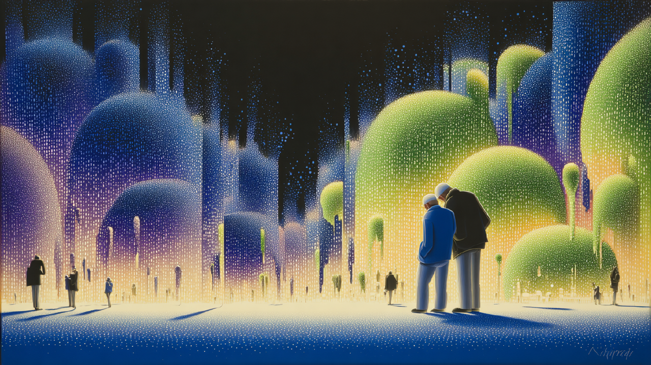
Reflection is embodied, whether you design for it or not Link to heading
Maurice Merleau-Ponty’s basic move in phenomenology is to treat perception as lived and embodied, not as a detached mind inspecting data 15 . Your body isn’t a peripheral device. It’s part of how meaning happens.
That’s why threshold rituals work when they work. A breath isn’t a message. A breath is a state change. It is a physical “hold on” that can interrupt the reflex loop without turning into a lecture.
This is also why some frictions fail. When friction is only cognitive (a warning label, a scolding modal), it competes with the fast system on its own turf. The fast system is good at ignoring text.
Terrain works because terrain is felt.
Here’s where a small Japanese concept can help without becoming a design fortune cookie: ma, the interval. The pause that gives shape. You can treat the pause as empty space, or you can treat it as structure.
A pause isn’t a pop-up. A pause is a shape.
Wabi-sabi, Dewey, and why polish can be the enemy of presence Link to heading
Design teams often equate polish with respect. There is truth in that. Sloppy UI is disrespectful.
But there is another kind of polish: the kind that smooths away every trace of time, effort, and incompleteness until the user is no longer participating in anything. They are simply being served.
Wabi-sabi, as Leonard Koren explains it, points toward an aesthetic that values imperfection, impermanence, and incompleteness 16 . In digital terms, that can translate into a willingness to leave room for the user to contribute, to linger, to not be hurried toward the next thing.
John Dewey’s pragmatist aesthetics makes a similar move from another direction. In Art as Experience, he treats experience as a whole, a flow of doing and undergoing, not a set of isolated outputs 14 . Value emerges through the arc of experience, not just the end state.
If you apply that to UX, you get a different standard:
A good experience isn’t merely efficient. It is coherent. It leaves the user more awake than when they entered.
This isn’t a call to make everything slow. It’s a call to stop assuming that speed is the only form of respect.
The ethical constraint: friction must not punish the time-poor Link to heading
There’s a reason many people flinch at the idea of adding steps. Time isn’t evenly distributed. Patience isn’t evenly distributed. Accessibility constraints are real.
Care ethics is helpful here because it forces design back into real context. Virginia Held frames care ethics as attentive to relationships and responsibilities, and skeptical of abstract rules applied without regard for lived situations 17 . When you translate that into UX, it sounds like:
Do not build a “pause” that only privileged users can afford.
The solution isn’t to avoid reflection. The solution is to design reflection with choice and adaptability.
- Make the friction opt-in when possible.
- Let users tune it.
- Provide alternatives that don’t require fine motor control or long reading.
- Don’t shame people for bypassing it.
Care ethics also gives you a useful gut-check: if the friction feels like a parent grabbing a child’s wrist, rethink it. If it feels like a trail marker that helps you orient, you’re closer.
Your thumb isn’t your mind. Your users aren’t your children.
How to prototype reflection next sprint without starting a rebellion Link to heading
Here’s a sprint-sized move that is small enough to ship, and sharp enough to teach you something.
Pick one high-frequency, low-intention action in your product. The action that users do “just because.” The thumb action.
For many products, it’s opening the feed.
Now design a threshold ritual that meets four constraints:
First, it must be short. Think seconds, not minutes.
Second, it must be informative, not punitive. It needs to help the user notice the action and choose.
Third, it must be user-steerable. Let the user set it, disable it, or apply it only to certain contexts.
Fourth, it must be reversible. If you overshoot, users can exit without penalty.
A concrete pattern that works surprisingly often:
When the user opens the feed, ask them to choose a mode before the content arrives: “Quick check (2 minutes)” or “Settle in (20 minutes).”
Then honor the choice. If they choose quick, make the feed finite for that session. If they choose settle in, don’t pretend you’re saving them. Just deliver the full experience.
This isn’t about restricting. It is about making the moment explicit.
Measure two things, both behavioral and human:
- Behavior: How often do users back out at the threshold? How does session length distribution change?
- Experience: Do users report feeling more in control, or more annoyed?
If you can, do a small qualitative follow-up. Ask a few users a simple question: “When you opened the feed, did it feel like you decided, or like you continued?”
If the best users say, “It helped me catch myself,” you have a foothold. If they say, “Stop treating me like a lab rat,” you built a speed bump. Adjust.
This is how you design terrain. You test the footing.
Back to the thumb, with a question that bothers you a little Link to heading
Let’s return to the scene where we started.
The coffee line. The train platform. The meeting lobby.
Your thumb opens the feed before your brain arrives.
Now the question:
When your user does the thing, are they choosing, or are they merely continuing?
And a second one, sharper:
If your interface can be used flawlessly while the user is absent, who is your product actually for?
Sources
- Thinking, Fast and Slow Daniel Kahneman (2011). Book page and overview. 1
- Slow Technology – Designing for Reflection Lars Hallnäs & Johan Redström (2001). Personal and Ubiquitous Computing. 2
- Reflective design Phoebe Sengers, Kirsten Boehner, Shay David, Joseph “Jofish” Kaye (2005). ACM conference paper. 3
- The IKEA effect: When labor leads to love Michael I. Norton, Daniel Mochon, Dan Ariely (2012). Journal of Consumer Psychology. 4
- The effort heuristic Justin Kruger, Derrick Wirtz, Leaf Van Boven, T. William Altermatt (2004). Journal of Experimental Social Psychology. 5
- “The Effort Heuristic” revisited: Mixed results for replications Collabra: Psychology (2023). Replication evidence and discussion. 6
- Making things hard on yourself, but in a good way: Creating desirable difficulties to enhance learning Elizabeth L. Bjork & Robert A. Bjork (2011). Chapter PDF. 7
- The “What” and “Why” of goal pursuits: Human needs and the self-determination of behavior Edward L. Deci & Richard M. Ryan (2000). Paper PDF. 8
- Directing smartphone use through the self-nudge app one sec D. J. Grüning et al. (2023). PNAS. 9
- A longitudinal in-the-wild investigation of design frictions to prevent smartphone overuse Luke Haliburton et al. (2024). CHI / ACM paper. 10
- Send or unsend Gmail messages Google Support. Undo Send cancellation period. 11
- Use Screen Time on your iPhone and iPad Apple Support. Lock Screen Time settings with a passcode. 12
- Forest – Stay focused, be present Forest app official site. 13
- Art as Experience John Dewey (1934). Book page. 14
- Phenomenology of Perception Maurice Merleau-Ponty (1945). Book page. 15
- Wabi-Sabi: for Artists, Designers, Poets & Philosophers Leonard Koren (1994). Author page. 16
- The Ethics of Care Virginia Held (2006). Oxford University Press page. 17